

Romanson, South Korea’s largest watch manufacturer, commissioned VIEWSDESIGN to create a comprehensive Corporate Design Program. At the time, the logo looked like this.

The goal was to design a more international logo that reflected the modern, global enterprise Romanson had become. The new logo was also intended to represent the two founding partners working together for business success.

To ensure readability in the company’s home country, we created a version of the logo in Hangul, the Korean alphabet. Additionally, recognizing the importance of international markets, we developed Japanese and Arabic versions of the logo.


We designed a full suite of corporate stationery, incorporating both Hangul and English alphabets. This included business cards, letterheads, various-sized envelopes, memo pads, and other collateral materials, all unified under the new brand identity.
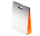


VIEWSDESIGN carefully designed the packaging to reflect Romanson’s international appeal. This included shopping bags, gift bags, and product cellophane bags, all integrated into a cohesive system across key touchpoints.
To further extend the brand, we developed several sub-brand logos and a distinctive collection of watches tailored to different target groups. A unique aspect of Romanson’s offerings is their specialized range of watches designed for couples, often gifted for weddings and anniversaries. This romantic gesture is deeply embedded in the brand, with the name ROMANSON reflecting the bond between partners, further strengthening the brand’s position as a leader in the watch industry.
